Share this Post

In this second making-of post, author/illustrator Julia Denos shares the reasoning, revisions, and character designs that became Swatch: The Girl Who Loved Color. For more, visit our All The Wonders of SWATCH feature.
“Black Tights and Stripes”
So there I was with a living story in my hands.
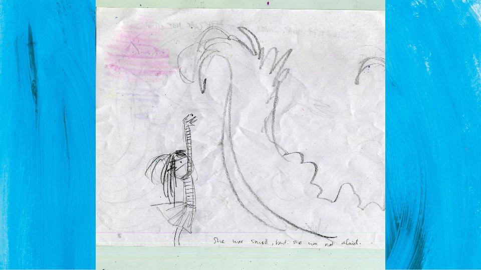
Our hearts were beating loudly. We were nervous, because we knew what the next step was going to be, and that was TO MAKE IT REAL. And we knew that for many ideas, sometimes this can mean death.
If I wanted this story to live, I’d have to become a translator, keeping one foot in the story’s world and one foot in my real world of book publishing. I would have to DO THINGS to it: make potentially disastrous decisions on style, ruthlessly slicing and dicing text, squeezing swathes of writhing color into page formats, pinning things down.
And I had JUST learned how very bad it was to try to tame anything about this book.
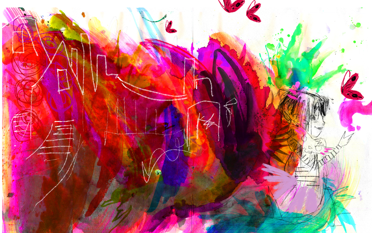
Swatch could have stayed a fantastically fun dream to return to every night! That would have saved me a lot of trouble, but it would not be the will of the Wild at all. This story was not mine, nor was it ever, and it wouldn’t be right to keep it for myself in a jam jar.
But I was afraid. Could I make Swatch’s story into a real book, and keep it alive?
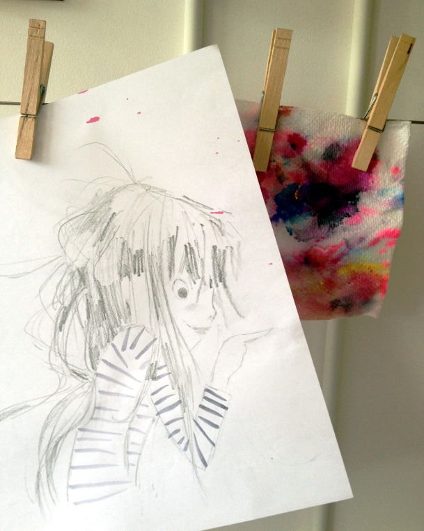
To ease into it, I focused on the living aspects of the story, the breath and the heart, to start turning it into a book.
Vital organs of a book:
1) A page turn is the book’s breath. It brings a book into real-time.
2) Character is the book’s heart. If people feel their hearts connect to one in the pages, they’ll turn the page and keep the book alive.
Character Design
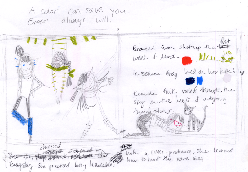
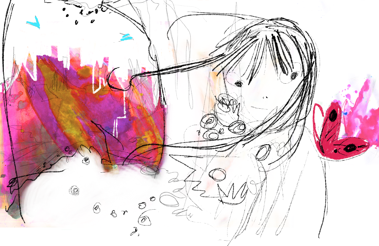
This was the first concept painting I did to explore style. Swatch didn’t have her stripes yet! I set out to know Swatch better, and explore her heart.
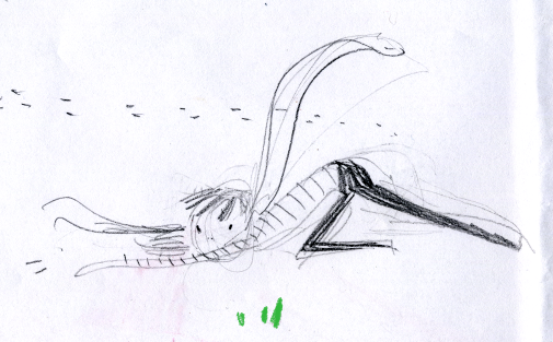
I wanted to express the LOVE first and foremost, between a girl and her colors. So I drew their relationship over and over. I pulled from my own deep love for animals and nature, and how it feels to be in harmony and relationship with a wild thing:
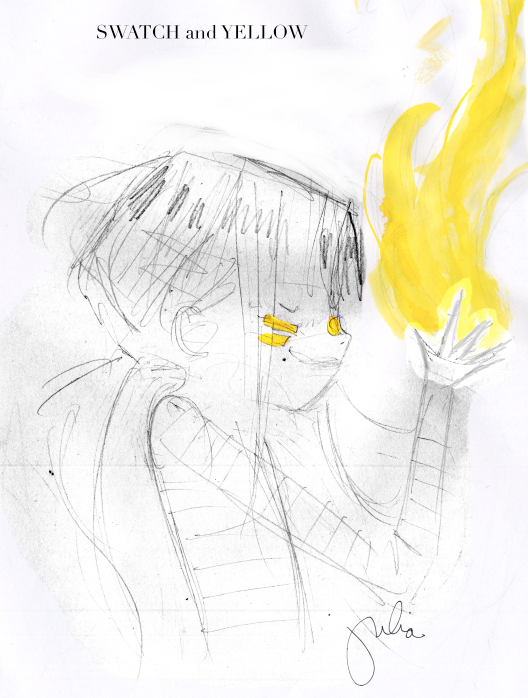
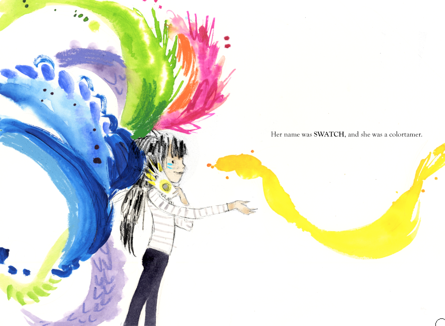
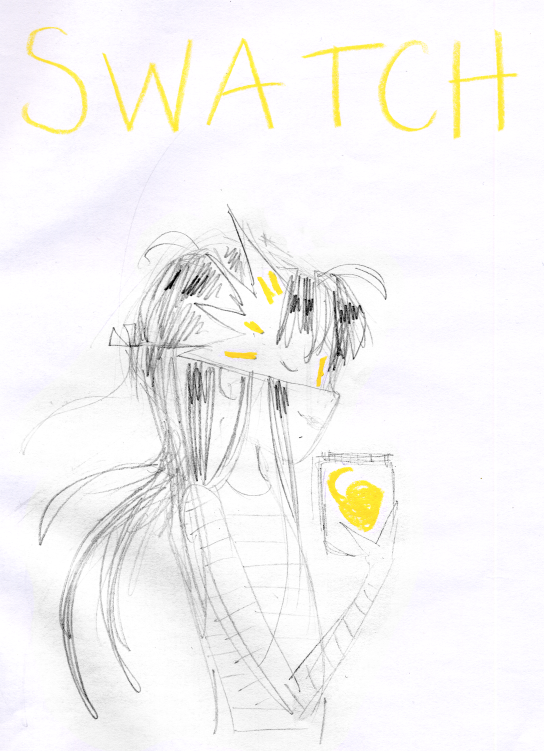
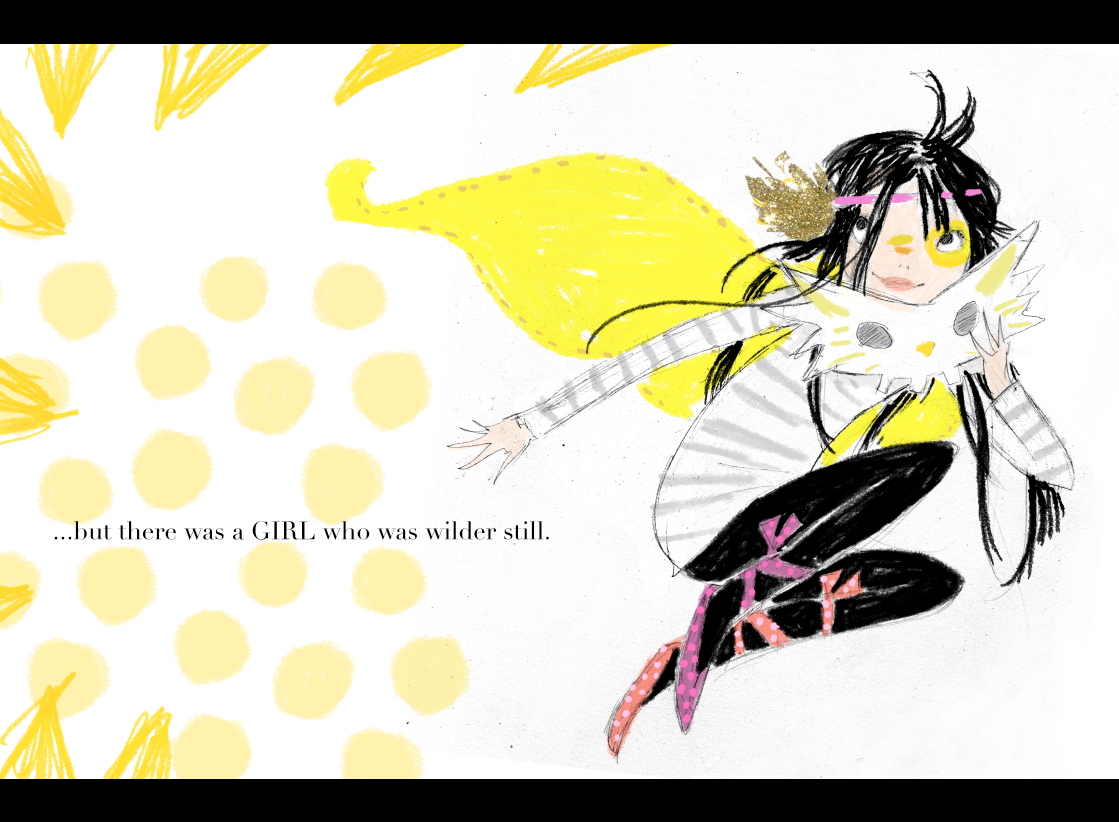
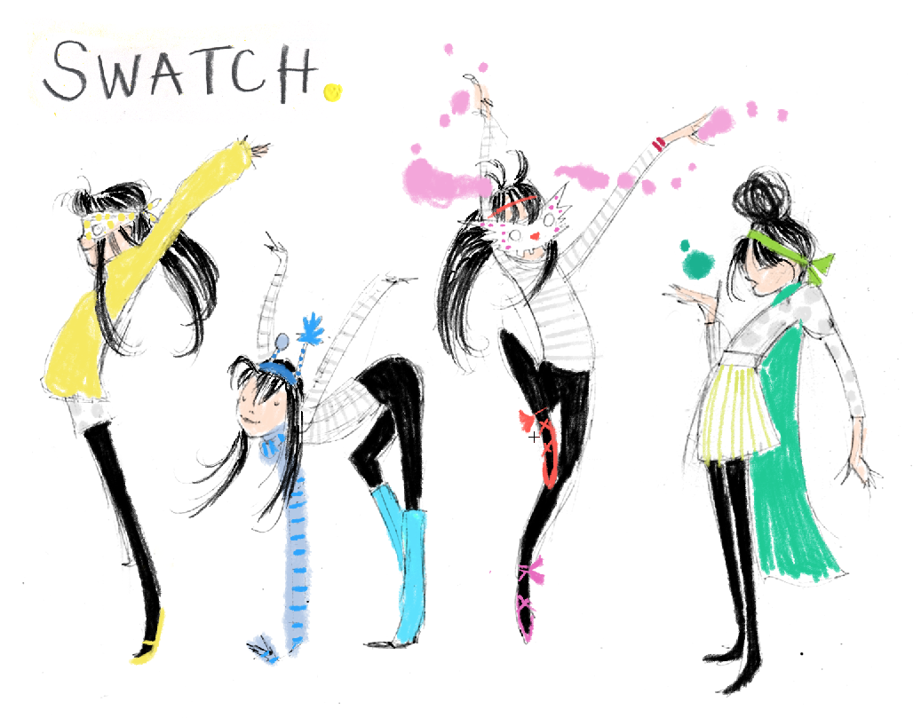
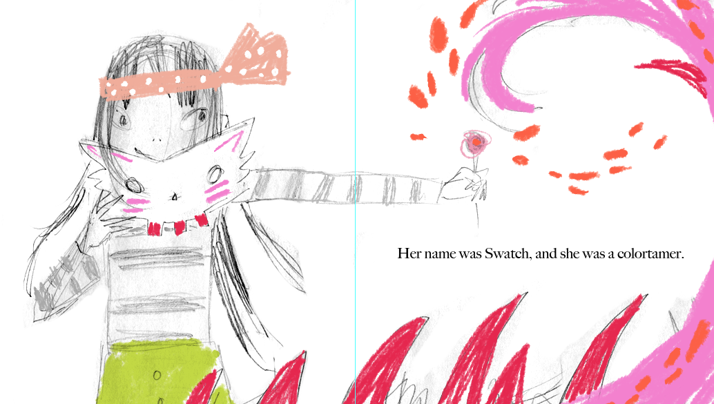
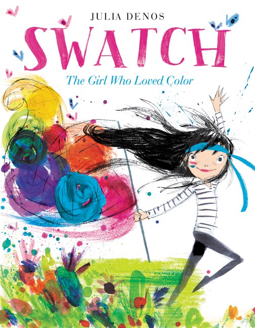
Black tights and stripes would help readers follow her movement against a world of moving color and texture. Later on, my editor, Alessandra Balzer, and art director Martha Rago and I would chat about the idea of making her more colorful, since she loved colors so much. I experimented with face paint, imagining that her romps with color might leave swipes and markings on her face.
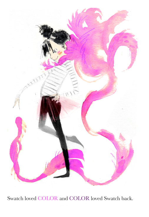
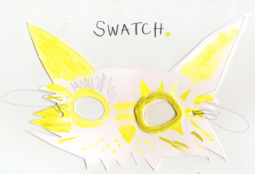
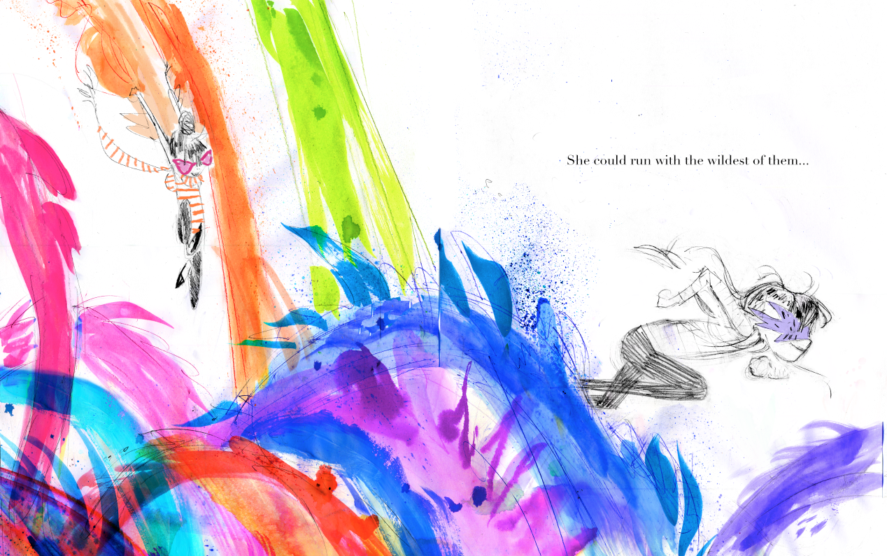
Up until the last second, Swatch the colortamer actually wore a mask! Alessandra and Martha suggested I try to remove the mask. It did allow the character to connect more directly to the reader, and the only mask remains in the spread “She could run with the wildest of them.”
With these two REAL WORLD things done, Swatch was ready to be sold to Balzer+Bray, and I began work editing the manuscript with editor Alessandra Balzer, and sketching the book out with art director Martha Rago. Now it was time for:
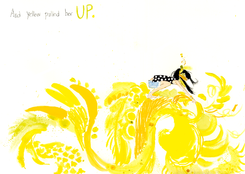
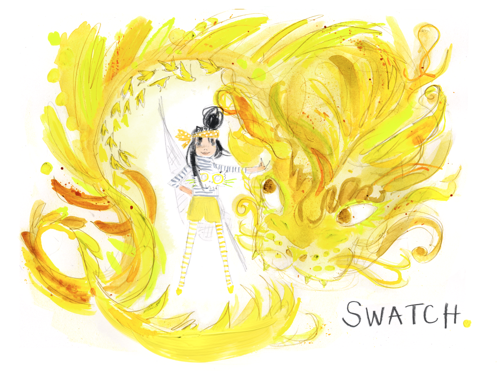
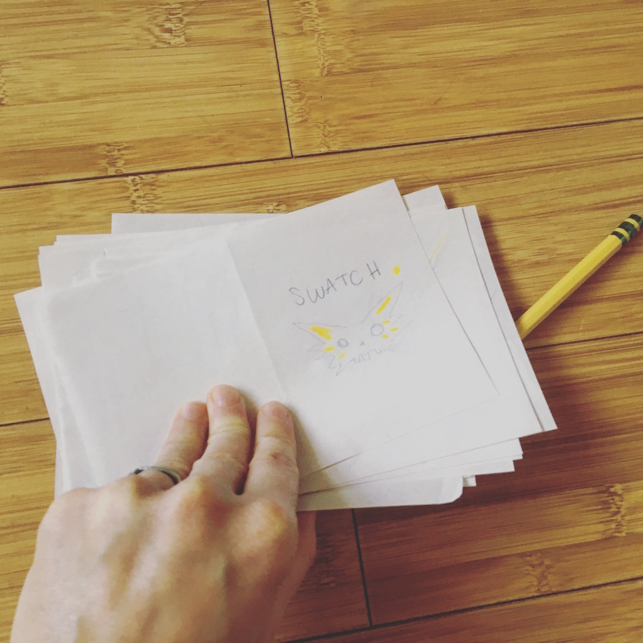
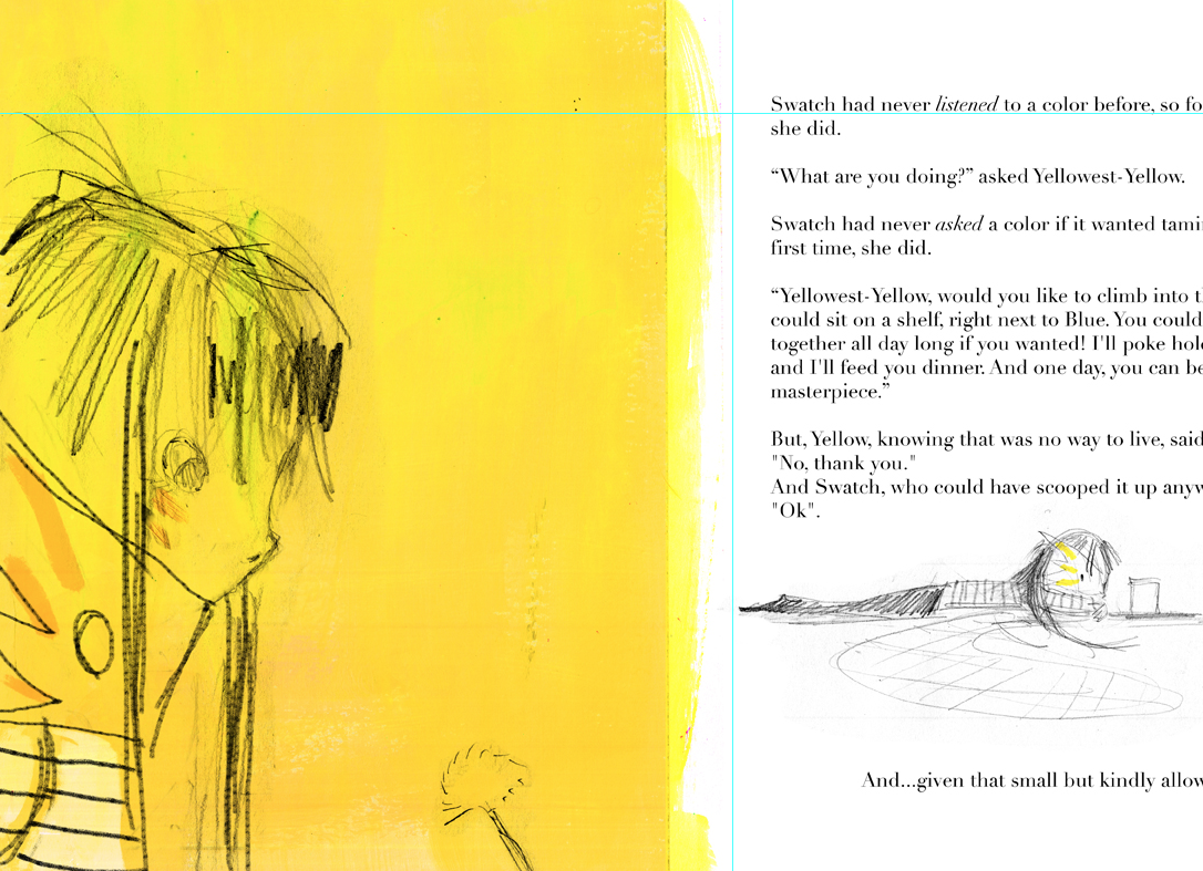
Yellowest Yellow was a character we talked a lot about. I tried Yellow with a face and without. Yellow is the only color with a face, the story tells us about its pointy teeth and ears, and this is the first color Swatch realizes is a person.
Page Turns
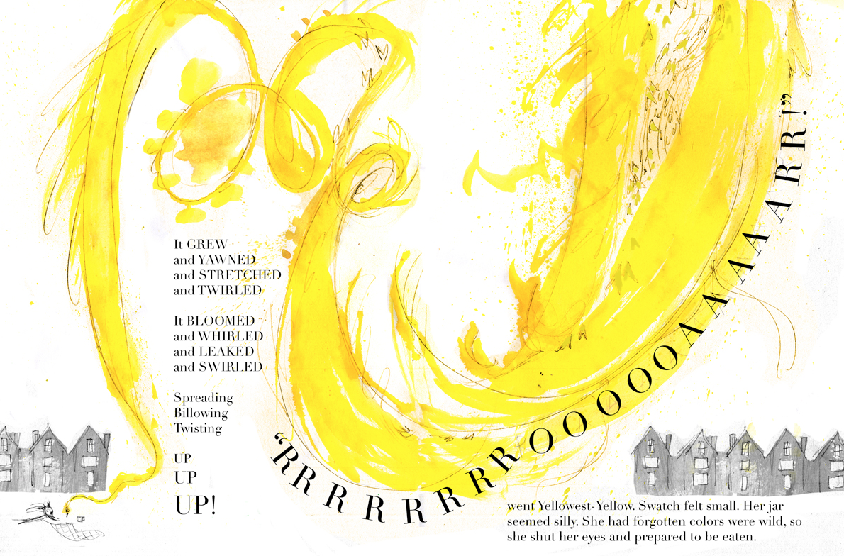
I started to break down the story by dividing the manuscript into 16 spreads that make up a picture book. I don’t know why, but I’m completely addicted to this part of bookmaking. I wish there was a job where I could divide stories into page turns and hand them off! Maybe it’s because I’m nuts and love structuring chaos. Maybe it’s the allure of that magic moment a story turns into a book. Maybe it’s the power: placing a page turn sets tone, pace, style, and can make or break your book.
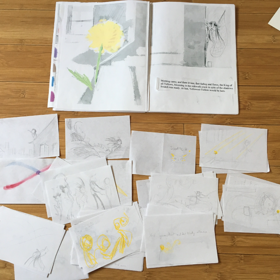
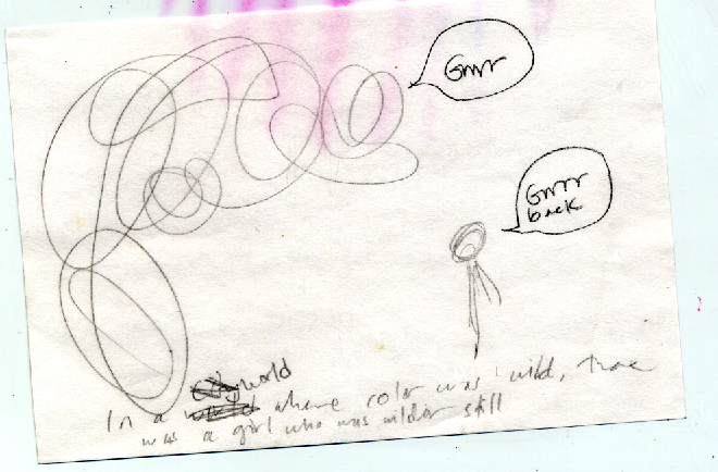
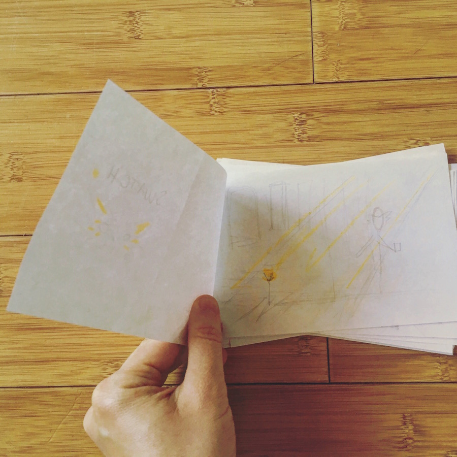
To finish writing Swatch, I had actually made a tiny dummy just so I could physically HEAR the page turn sound between sentences, because that’s how the book would actually sound.
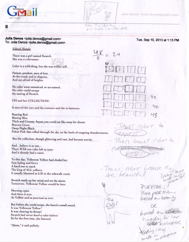
Rhythm and Syllables! I obsess over those things too. I want a story to deliver itself out of any mouth with ease and design. I never want language to be a distraction from the story. Every bump of a word is there for a reason. Picture book manuscripts are tiny sculptures and they take forever. By the time it got to my agent, Brenda Bowen, the text tucked in tight. I read it aloud every day, all day, to my cat. To Matt. To my friends. To the wall (and my confused neighbors on the other side of it). Splicing. Dicing. Cutting.
Book Dummies
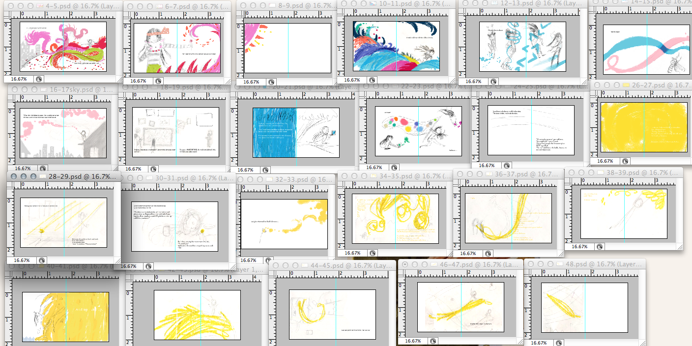
Many images floated through over three years, so I had to narrow them down by subject in tiny thumbnails:
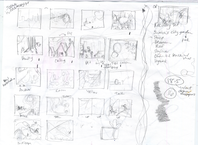
When I brought them into Photoshop for quick color, I realized the last half of the book was almost exclusively Yellow! So I’d have to work on that…
Movement
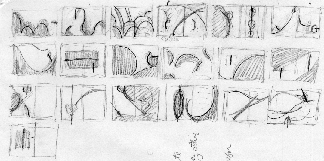
After a few months of thumbnailing, I looked at overall movement. It was a huge help to just to focus on abstract shapes, follow lines of energy, feel the flow, without any detail or even color distracting me. (A great book that taught me to view the book as one whole animal is Writing with Pictures: How to Write and Illustrate Children’s Books by Uri Shulevitz.) Then it was time to use the thumbnails as a guide for larger sketches to scale.
SECRET DELETED SCENE! :
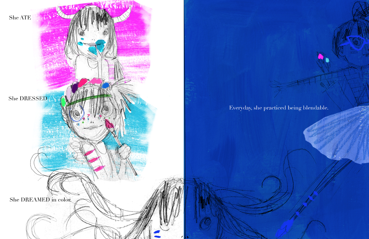
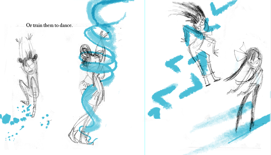
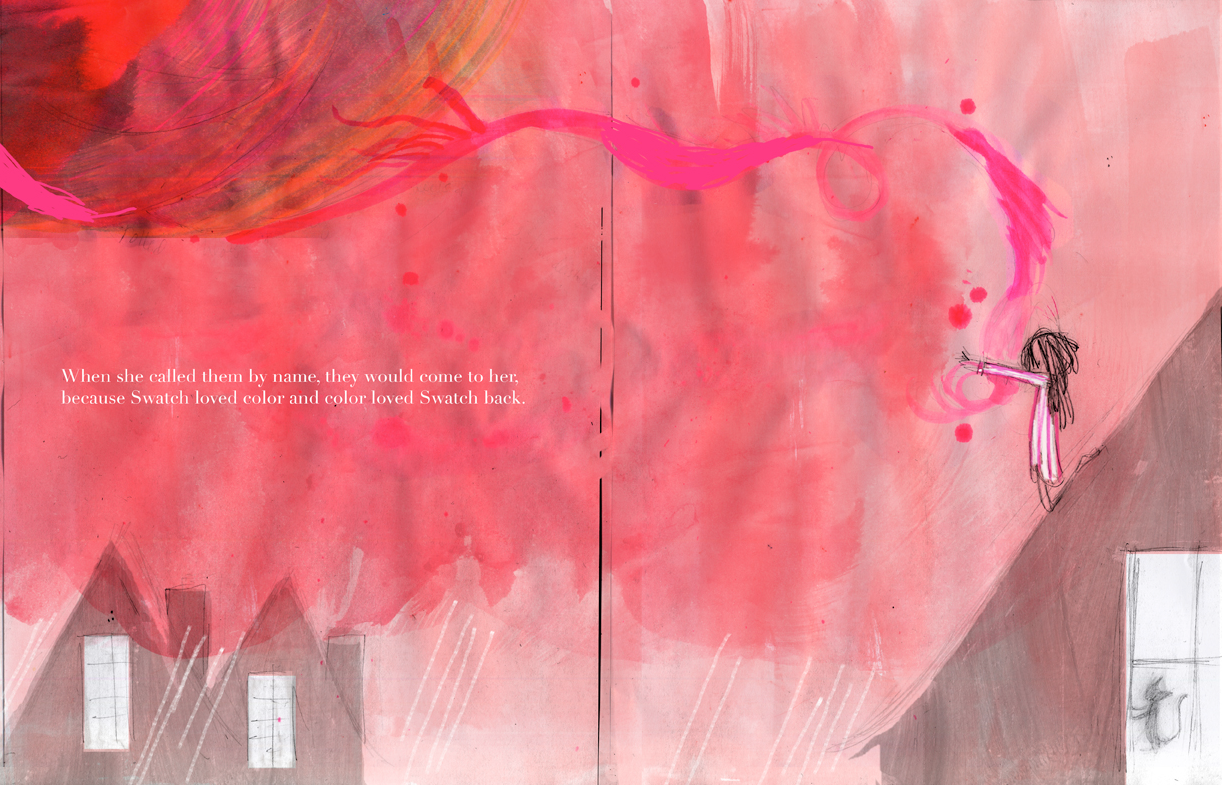
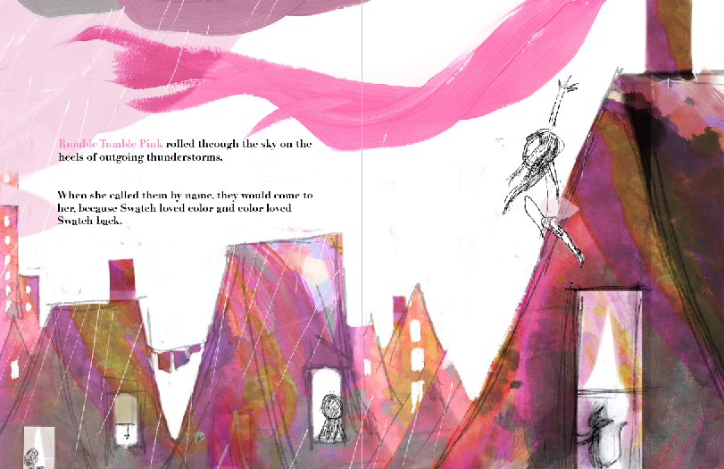
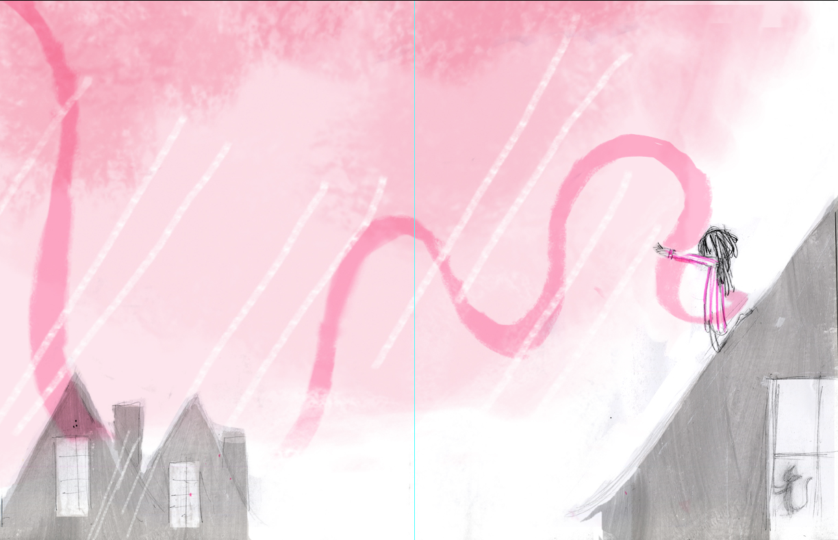
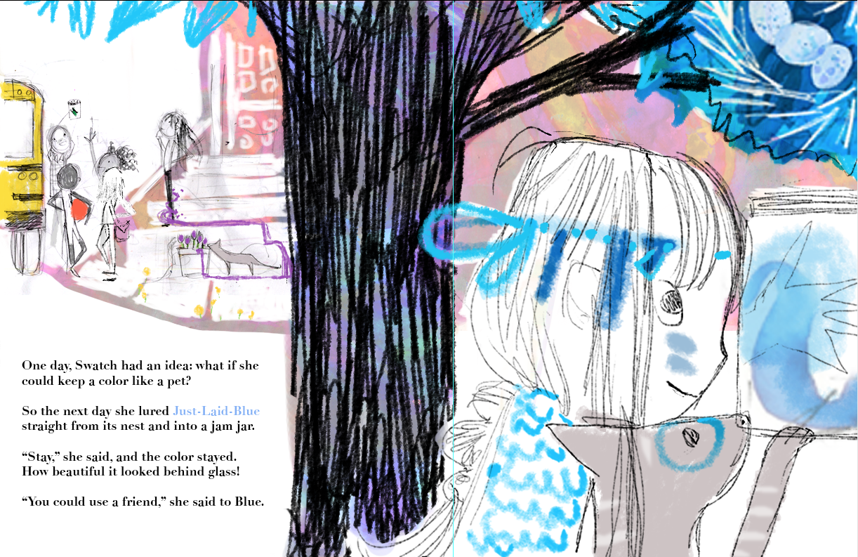
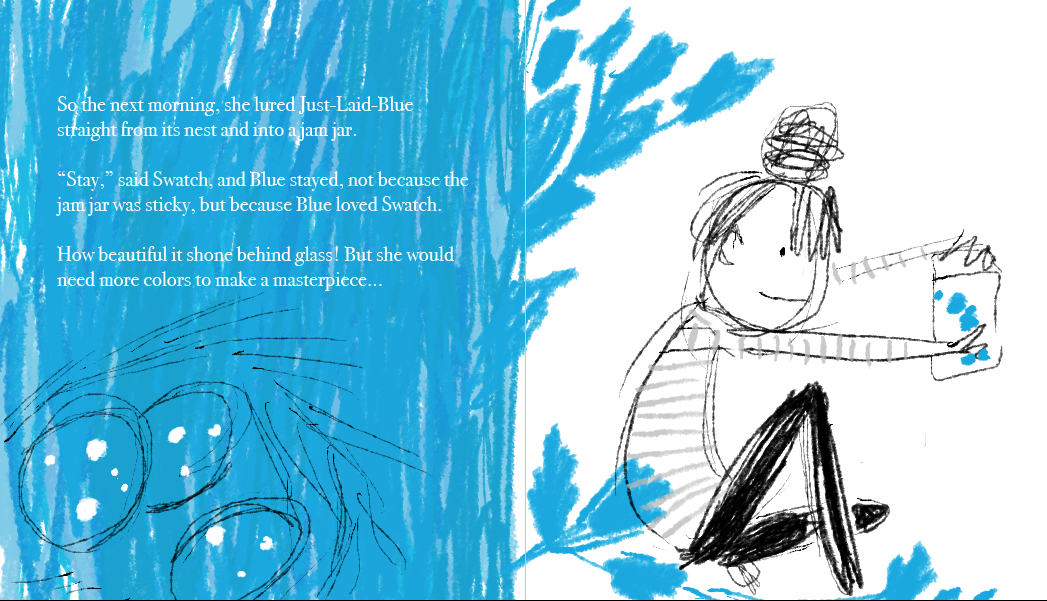
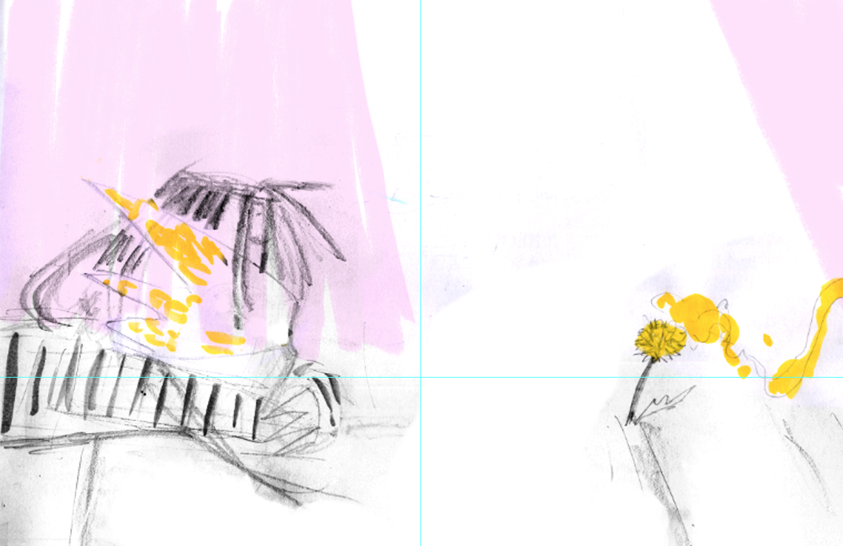
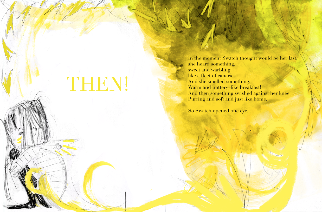
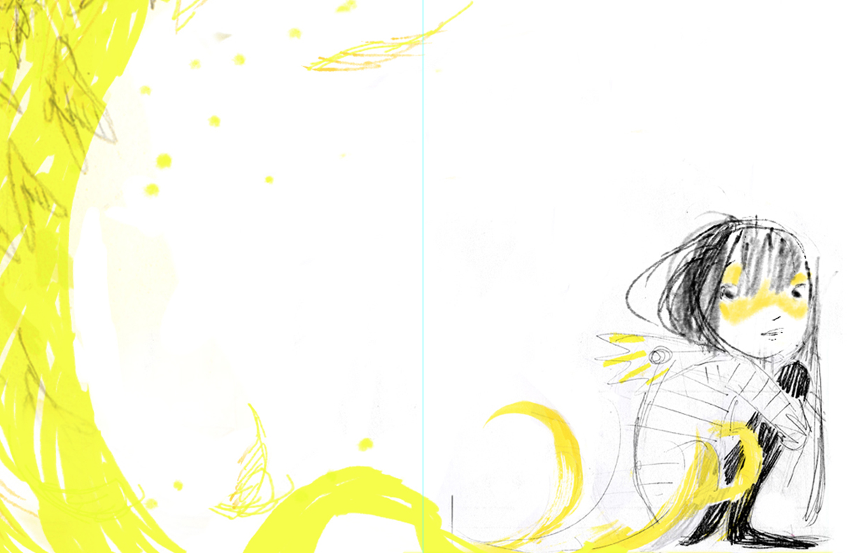
The scenes I narrowed down took many forms through the years, and once I sold the book went through MANY MORE variations. Each scene existed as 6-7 versions by the time I was OK to go to final art. I thought it would be neat to show you progression of a few through the full-scale book dummies with the Balzer+Bray team:
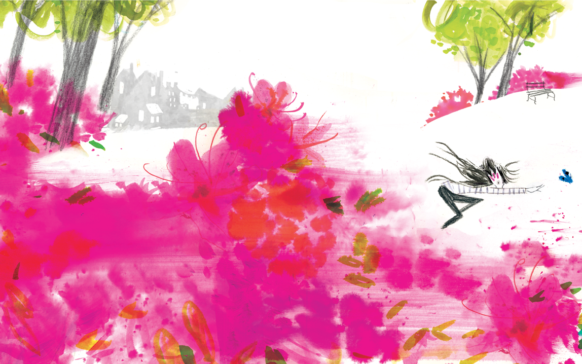
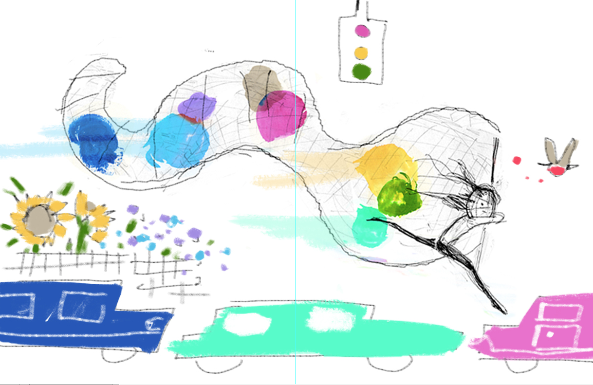
Martha, Alessandra, and I talked a lot about what taming color was. Martha urged me to “make the colors come from REAL WORLD things children will recognize.” I resisted this at first (defending the Wild) but then remembered the dandelion in the cracks. So in went butterflies, eggs, and gardens, traffic lights and a leaky night sky. This would probably be the single most important change for the entire book, and built a bridge between an abstract and real world for readers to get closer. Thanks for your wisdom, Martha.
Alessandra helped me tighten the manuscript by removing parts of the story that didn’t seem integral. She was a careful story surgeon, and let me keep most my syllables. She also gently reminded me of my overuse of “THEN!” Thank you, A!
It takes a special person to be able to climb into a story (and into the mind of an author or illustrator) and point out the essential things within the work, and encourage you to enhance or release details. Martha and Alessandra were extremely practical and posed lots of questions of a story that resisted reality, which is exactly what it needed. They asked: how would the color look? How would it live and move in the real world? What paint would I use? These are things I just couldn’t solve until I was at the painting table, and I was deeply grateful for Martha and Alessandra’s trust in me when I promised: “the color will contain canaries, and butterfly wings, and appear alive in the final.”
When I got the “OK” I couldn’t believe it. After years of hard work, we had built a book together, brought something Wild into the real world. I still had my heartbeat, and so had the story, in fact, its heartbeat was clearer than when I had begun. Now it was time to really let the Wild do its thing…final art!
Thanks, Julia!
Be sure to check out our ALL THE WONDERS of Swatch page for much more, including a look inside the book, a podcast interview with Julia Denos, , coloring sheets, a face paint guide, and an original Color Tamer game created by our team.

Julia loves words and pictures, making a mess, and cleaning up. She has worked in a variety of creative industries as an author, illustrator, and designer. Watercolor is her favorite medium because it’s the wildest. She lives near the ocean just outside of historic Boston, a good place for a time-traveling Piscean. Visit her online at juliadenos.com and on Twitter at @JuliaDraw.




















Comments
Thanks for a wonderful insight into this gorgeous book, a favorite at bedtimes in our house!
Pingback: ALL THE WONDERS OF Swatch | All The Wonders